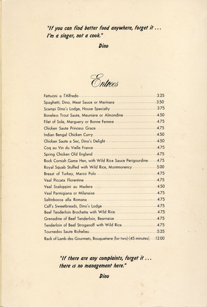
The L.A. Public Library just launched a book and an exhibition called “To Live and Dine in L.A.,” both of which show off some of the tens of thousands of menus they have in their collection. And curator Josh Kun wants these things to be read like historical texts, tracing the history of everything from L.A.’s class divides to its design sense. This week, he gave Rico a quick tour of the exhibit.
Rico Gagliano: OK. So, we’re starting at a segment of the exhibit that is dedicated to menus from the Lord Printing Company. Why is this an important company?
Josh Kun: They were the only printing company in the United States who were dedicated exclusively to printing menus.
Rico Gagliano: For the whole country, or just for L.A.?
Josh Kun: Mostly for L.A., but they did some stuff throughout the Southwest. They did some stuff for Vegas, a few stray things farther east, but mostly out west. But Lord was also famous because they were the first people to put color photographs on menus, so we have, allegedly, them to thank for that trend.
Rico Gagliano: Those kind of garish, overly red photographs of Waldorf salad and things?
Josh Kun: Exactly. I mean, you know, garish color? That’s Los Angeles.
We’ve got the original printing blocks for cookbooks for The Brown Derby and for a rare Brown Derby menu with an FDR silhouette. That’s FDR right there.
Rico Gagliano: I’m just… I’m flabbergasted by what looks like the blueprint for a Big Boy menu. That’s just a piece of America that can’t be replaced.
[Ed Note: See more videos from the exhibit here.]
Josh Kun: Absolutely.
Rico Gagliano: It’s like looking at Elvis’s corpse or something.
Josh Kun: Yes.
Rico Gagliano: All right, let’s go to maybe your earliest menu.
Josh Kun: Sure, earliest menu in the library’s collection is here in the exhibit, from 1875, from an annual feast and ball that was thrown by a guy named Don Mateo Keller at his winery downtown, and it was an invite-only banquet that featured all sorts of meat products.
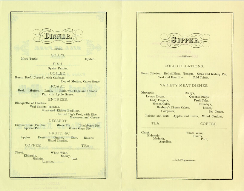
Rico Gagliano: This is one of the examples of how menus are documents of privilege.
Josh Kun: Yeah, in some way. I mean, most of… in the late 19th century, if you were eating out, you had money. Dining was still a real privileged act. So most of the earliest menus that we have in the collection are mostly banquet menus. You know, very elaborate, elegant hotel banquet menus, private celebrations. We’ve got a menu that was a dinner for Albert Einstein, for example. Haile Selassie — it’s good to know he was served melon balls orientale, which I like quite a bit.
Rico Gagliano: This, of course, would be the guy on whom Rastafarianism is sort of based.
Josh Kun: Yeah. I mean, he’s a very controversial figure historically, so it’s kind of fun to be able to sit down and see what he ate when he visited Los Angeles.
Rico Gagliano: But the thing about these menus, and this first one that you’re pointing out — the earliest one you have — is it’s so subtle. It basically says “dinner” in a kind of very turn-of-the-century looking font, and then it just has stuff listed. And the thing that strikes me about it is, that’s very similar to the menus you see today — these kind of stripped-down, very minimalist menus.
Josh Kun: Yeah, absolutely, the kind of return to simplicity that we often see now, I think, is an echo in some ways of that early printing and design style. With the difference that there are very few adjectives on this menu. So, you will never… it doesn’t often tell you how things are cooked or what ingredients are used. So, if it’s a meat, it’s just going to say it’s “veal.”
Rico Gagliano: But why is that?
Josh Kun: I’m going to guess it’s immense trust! That you are going out to a banquet at a winery in 1875, and you’re going to be very happy with what was given to you.
Rico Gagliano: Regardless, money had been spent, and it would be showing up on the plate.
Josh Kun: That’s about right, yeah.
Rico Gagliano: All right. You also have a section of menus where the menu reflects what is being sold.
Josh Kun: That’s right. Because famously, L.A., as a car city… we have had an architectural trend where buildings were often designed to look like the things that they sold. So: the hot dog stand that looks like a hot dog, the donut shop that looks like a donut.
Very interestingly, you then go through the menu collection, and you find that there’s menus that echo that trend. So, we’ve got programmatic architecture; these are programmatic menus. This is a menu for a buffalo steak shaped like a buffalo. The Redwood House, whose menu is a redwood tree—
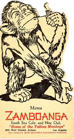
Rico Gagliano: It looks like a cross-section of a redwood tree. Oh, and then we’ve got… what is this? This is a menu that is shaped like a monkey.
Josh Kun: Yeah. So, these are…there are a few that are a little off the mark. So, this was a part of one of the many South Seas, vaguely Polynesian restaurants.
It was a big trend in Los Angeles in the last century, and one of the earliest and most prominent was the Zamboanga restaurant and nightclub. They’ve got a Philippines namesake, and they decided, “What else says Philippines better than a monkey smoking a pipe on the cover of the menu?” So some, you’re a little bit like, “I’m not sure what they were going for.”
And then a lot of them are actually mixed in with miniature menus, so they’re really small menus.
This is probably one of my favorites [shows menu]. This is for the Phillip’s Whiz Inn from 1943, and it is a chicken restaurant, so you’ve got — the menu is in the shape of a chicken. But it’s also incredibly tiny.
We’re only displaying the cover. If you were to flip it over, it’s as if they had done the layout of the text, like, with tweezers. I mean, three-point font. It’s incredible.
Rico Gagliano: Why is that? Why are they so small?
Josh Kun: There was a trend that kind of took off in Los Angeles, but that I do think was national, which was the souvenir menu. There were all these souvenir menus that were meant to be little and portable, that you could then put a little stamp on, and send it to a friend.
Rico Gagliano: The equivalent of bragging. It’s the pre-Instagram version of bragging about how awesome you eat.
Josh Kun: Yeah, exactly. It’s like analogue social media.